Simplicity
Lightness
Clarity
Transparency
Recognition
Guidelines
Simplicity, lightness, clarity, transparency and recognition. These five principles still guide the design choices in all contexts. The market, sensitive and complex, and people, heterogeneous and often in difficult situations, require particular attention to maintain a positive experience that easily risks bringing stress and frustration.
Step one: engagement
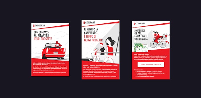
In 2016 meduse began to realize assets for Compass digital marketing: dem, banner, landing page, video animations. Since then and thanks to our contribution, Compass positioning has evolved and marketing strategies have been more and more involved as conversion tool. User experience begins outside of digital properties.


Online loan. Completely online
In 2017, meduse is asked to review the user experience of the online loan application process. This is the start of an intense co-design phase: internal and external actors working together to improve the performance of the process by simplifying the user experience. The result is remarkable and enables Compass to optimize marketing strategies, directing users to the bank offices or online according to their different needs.
Let’s meet up. It just takes one day
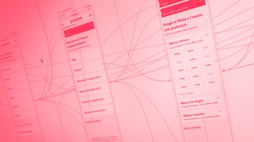
Thanks to the results achieved, Compass and meduse open the construction site of the make an appointment' process. Compass' business model is closely linked to the concept of proximity, thanks to its widespread presence in the territory (over 200 branches). The starting point for the design of the new application is the mobile use. What is the nearest branch? Is it crowded? What is the first availability? These are the questions the application wants to answer. The user experience was revised a first time in 2017 and a second one in 2019. The focus has shifted from quantity to quality: through user experience it is possible to improve the quality of leads.
Accepts statistical cookies to view the video.
Click on the button to change the cookie settings.

Nel progetto del 2019 il focus si è spostato sull’utente con l’introduzione dell’appuntamento “veloce”, suggerito dal sistema.

Join Compass
In 2019 the guidelines behind all the products mentioned above, became the pillars for the design of the new Compass website. By now over 70% of traffic is mobile, commercial offer is wide and articulated, customer journey passes through multiple contact points. The new website is designed and developed around the user: a modular structure that enable the personalization of content based on interests and needs. The interface is a framework through which build coherent.

What about numbers?
The results obtained have been really satisfying, and each goal is just the start of a new challenge.
