Designing a new identity
To meet these needs, our design approach focused first on an in-depth analysis of all the aspects that most contributed to make Etica Sgr a leading savings management company for sustainable and responsible investments.
To find the right positioning we leveraged three aspects: tone of voice, user experience and visual identity, making sure that they could work in synergy to offer the user a complete, consistent and above all credible experience.
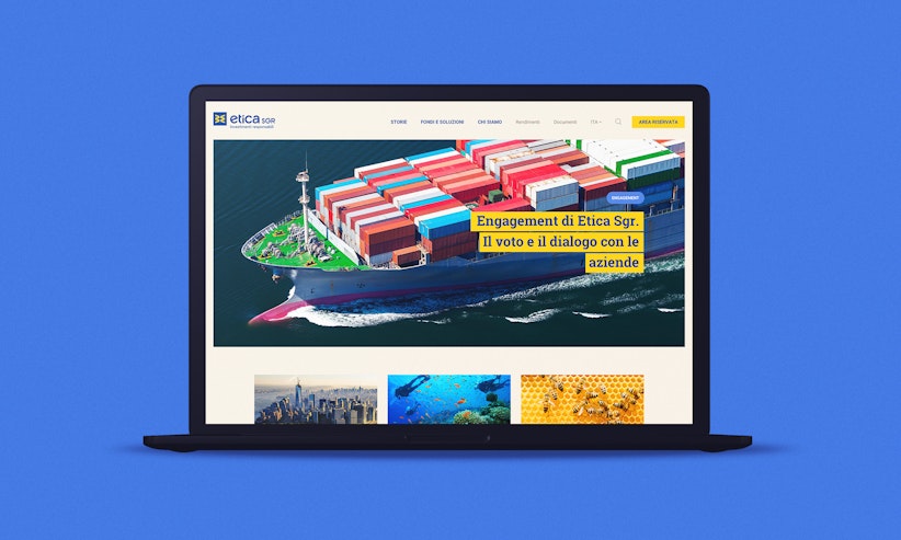
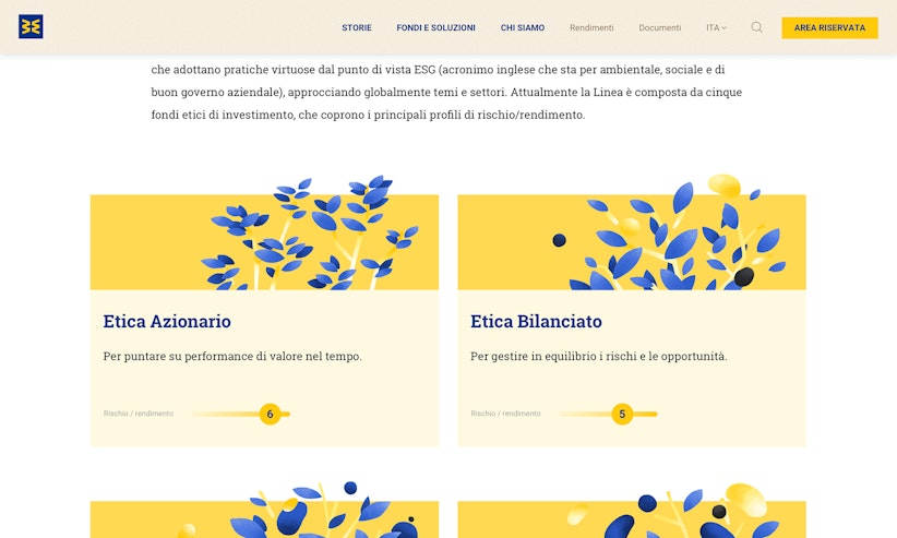
New color palette, typography, original handmade illustrations to describe the ethical choices behind the products offered, with a great care for details and a material feel able to recall the humanitarian values of the brand.
The redesign process proceeded with the reorganization of the information architecture, to highlight the "Stories" section dedicated to news and in-depth analysis of the main themes - environment, social and governance - specific to Etica Sgr and the activities it carries out daily in the sector, optimizing its SEO visibility.
+27% new sessions, +38% new users in the first 5 months
A trustworthy leadership
All those choices constributed to improve the perception of the brand with a UX designed to guide the user, helping him to choose how to invest more consciously.
A new website able to make the values of Etica Sgr perceivable from the moment of titles selection, to the formation and dissemination of the ESG themes and the modalities of subscription of the funds.


